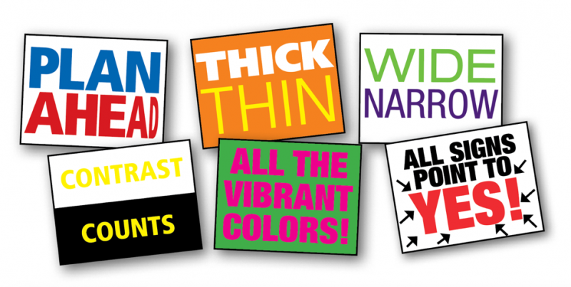
Create a Protest Sign That Will Stand out in a Crowd.
It’s been 2 turbulent years since the Trump administration took office and people continue to voice their frustration by carrying protest signs at marches. Grassroots movements are popping up everywhere. Individuals influencing action is what will move our nation forward. Even a scrawled cardboard sign can make an impact. So, when you’re looking to make an impact with a protest sign, don’t forget that your design is just as important as your message. Legibility, layout and contrast are key elements to an impactful sign. Here are some tips to help you get your message across.
Legibility:
Fonts may not be something you actively think about, but you experience them every day. Fonts can be utilitarian or expressive. Even though you’re probably making your sign by hand, you still have to think about your font choice. Will you use block, bubble or stenciled lettering?
If your message is long, you’ll want to pick lettering that is on the narrow side. (That does NOT mean the same as thin!) The strokes of each letter should have a relative thickness to them to be legible from a distance. Test it out by viewing the sign from several feet away. Spacing between letters and words is called kerning and is important for legibility. You don’t want your letters so close that they mush together from a distance.
Layout:
Some organized marches don’t allow protest signs with sticks or poles attached. If that is the case, be sure to leave space for your hands so you’re not coving any lettering. Do a pencil sketch to map out your whole layout before filling in with marker or paint. Think about which orientation is optimal for your message. Will your poster board be horizontal or vertical? A mix of lettering sizes can also be useful to emphasize key words. And don’t forget to make key words larger, bolder or a contrasting color.
Color contrast:
Bright colors can be eye catching, but you have to be sure there is enough contrast. For example, yellow letters on a white background are barely visible. Without delving too deep into the world of color theory, keep in mind that simplicity is best for this type of project. Prominent colors should be paired with neutral colors. Two bright colors together, Chromostereopsis, will drive your eyes bonkers. Using two competing prominent colors is the design equivalent of using ALL CAPS and 3 exclamation points!!! Just don’t do it.
A few notes on materials:
• Foam core boards are much sturdier than poster boards.
• Fine tip markers mean a lot of filling in. Use wider markers or paint.
• You can buy precut letters to glue to a sign, the downside is you can’t control the layout as well.
• Consider using an old sheet for long banners. You can paint the letters and fold it away for ease of transportation. (Bonus: You can pick one up from a thrift store for cheap!)
Say it proud:
Once your protest sign masterpiece is complete, send us a picture of your creation. We’d love to see your handiwork. Still need help getting your message out? Get more information from our advocacy post The Difference Between Advocacy Strategy and Advocacy Tactics.