Make All the Other Democratic Direct Mail Jealous!
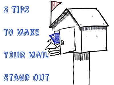
“Nasty, brutish and short,” doesn’t just sum up Thomas Hobbes’ feelings about the state of nature – it also applies to the often-lonely life of a piece of Democratic direct mail. It’s tough to get noticed and stand out from the other items stuffed in the mailbox, and even if it does get noticed, it’s usually quickly tossed out and forgotten. Sad stuff if you’re a piece of Democratic direct mail. But your Democratic direct mail doesn’t have to exist in a Hobbesian nightmare (extra points if you’ve slogged through Leviathan). Here are a few tips to help your direct mail stand out from the crowd and avoid immediate relegation to the dumpster.
1. Have some fun.
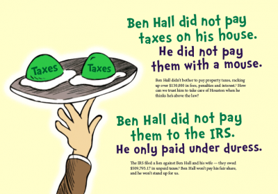
While you probably want to have some mail in your program that is all business, it doesn’t hurt to have some fun. It’s not particularly interesting to watch an interview or a speech where someone is hammering you with facts and statistics, or pedantically talking at you about their cause or candidacy. The same (perhaps unsurprisingly) goes for mail. If you can communicate your message in a humorous or fun way, you may draw people in enough to actually make an impression.
2. Say it, don’t spray it. Your words are valuable to you, but they’re likely not all that important to the average person reading your Democratic direct mail. Readers probably place much more value on their time, which is why, generally, you’ve got just a few seconds to catch someone’s attention at the mailbox, and just a few additional seconds of their time if they decide to peruse the piece a bit further. Given that fact, you’ve got to get to the point, and you’ve got to get there quickly. Democratic direct mail should not look like you’ve fire-hosed it with information. Whatever you write, cut it down, and then cut it down again.
3. Look good while you’re doing it. Maybe it’s because direct mail isn’t the sexiest of campaign communications mediums, so people don’t bother to fuss over it, but I see a LOT of really ugly mail every election cycle. I’m a weirdo who works in Democratic direct mail, so I collect that kind of thing to pass around as examples of what NOT to do, but most people won’t give those mailers a second thought. I should note that I’m not talking about letter packages, which have been shown to be more effective the more governmental (read: ugly and utilitarian) they look. I’m talking about postcards – mailers where graphics and images play a central role in the look and feel of the piece. Take the time to make sure that your mail looks professional and inviting (even if you’re saying something mean – but true – about your opponent).
4. Get real, bro. A lot of the barbs that get tossed around throughout an election are incredibly abstract for your average voter. Saying that Councilmember John Doe has a record of waste and mismanagement certainly doesn’t sound great for John Doe, but how does it actually impact a voter’s daily life? Making that connection is critical for any campaign. If you can find a real live person who is willing to go on the record for a testimonial mailer, go for it (and get a professional photographer to handle the photos).
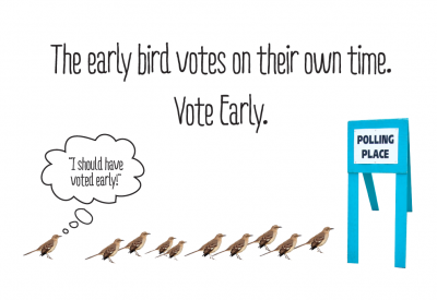
5. Put a bird on it! Yes, this one is an excuse to watch some Portlandia, but it’s also about thinking outside of the run-of-the-mill Democratic direct mailbox (I’ve used this before and it never gets old, folks!). I actually did put a bird on it in Houston for some GOTV mail, and the response was great
Seriously though, think about how many GOTV mailers voters receive each cycle, and how many of them feature images of a raised hand or a ballot box. At some point, if you don’t rethink the same-old-same-old, those images become staid and less effective. While I wouldn’t just toss the baby out with the bathwater here, I would urge you to think about how you can approach your message from a different angle – you may just catch an eye and save a mailer from going unread.
Got Questions? Contact us here

